Build a Single Line Chart
This page is currently under review. Stay tuned!
Last updated
This page is currently under review. Stay tuned!
Last updated
A single line chart is a type of cartesian chart that displays information as a series of data points connected by straight line segments progressing over a period of time.
The single line chart is used to show data changes at equal intervals of time. A single line chart must be used for monitoring any numerical date (e.g. sales, impressions, users, count number of categories…) over a period of time.
This chart is available only when an over time objective is selected: this objective shows the evolution of data in a given amount of time, e.g. Can you show me summer 2020 sales?
Remember that if you need to show the evolution of a measure within a category change, you must use a column chart.
If you want to know more about objectives and visualizations, check out Objectives and visualizations.
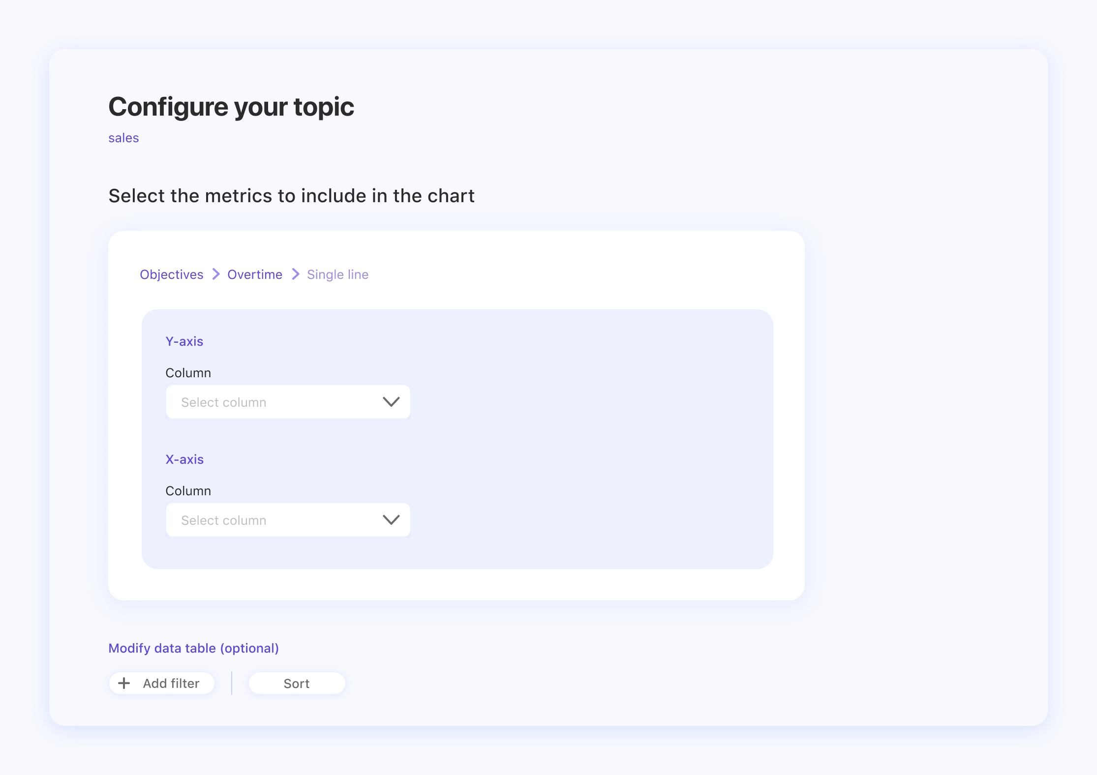
In order to build a single line chart, you have to select a data table that includes at least one column with times series data type, to show how an item evolves over time.
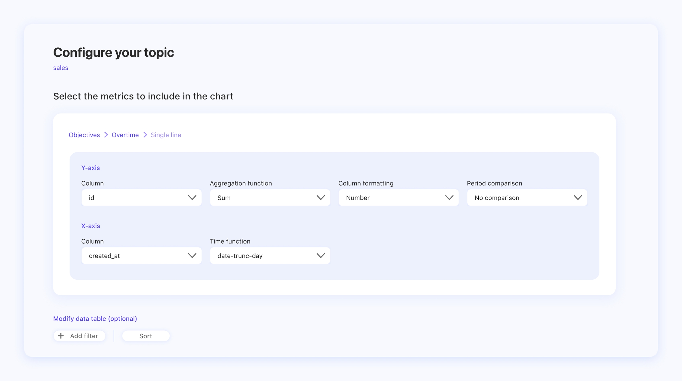
The Y-axis’s Column selection indicates the entity that will be measured over time. For example, if you want to understand how your Sales are trending over time, you would select the Sales column.
Select an aggregation function to decide how to group the rows together in order to form a single summary value. For example, you want to know the total sum of sales for each day. In this case you would select SUM as your function.
The column formatting field is about the data type and its related unit of measure during the topic configuration. In the example of the topic Sales over time, you would select Sales as a column and subsequently the currency, for example Euro, as a column type.
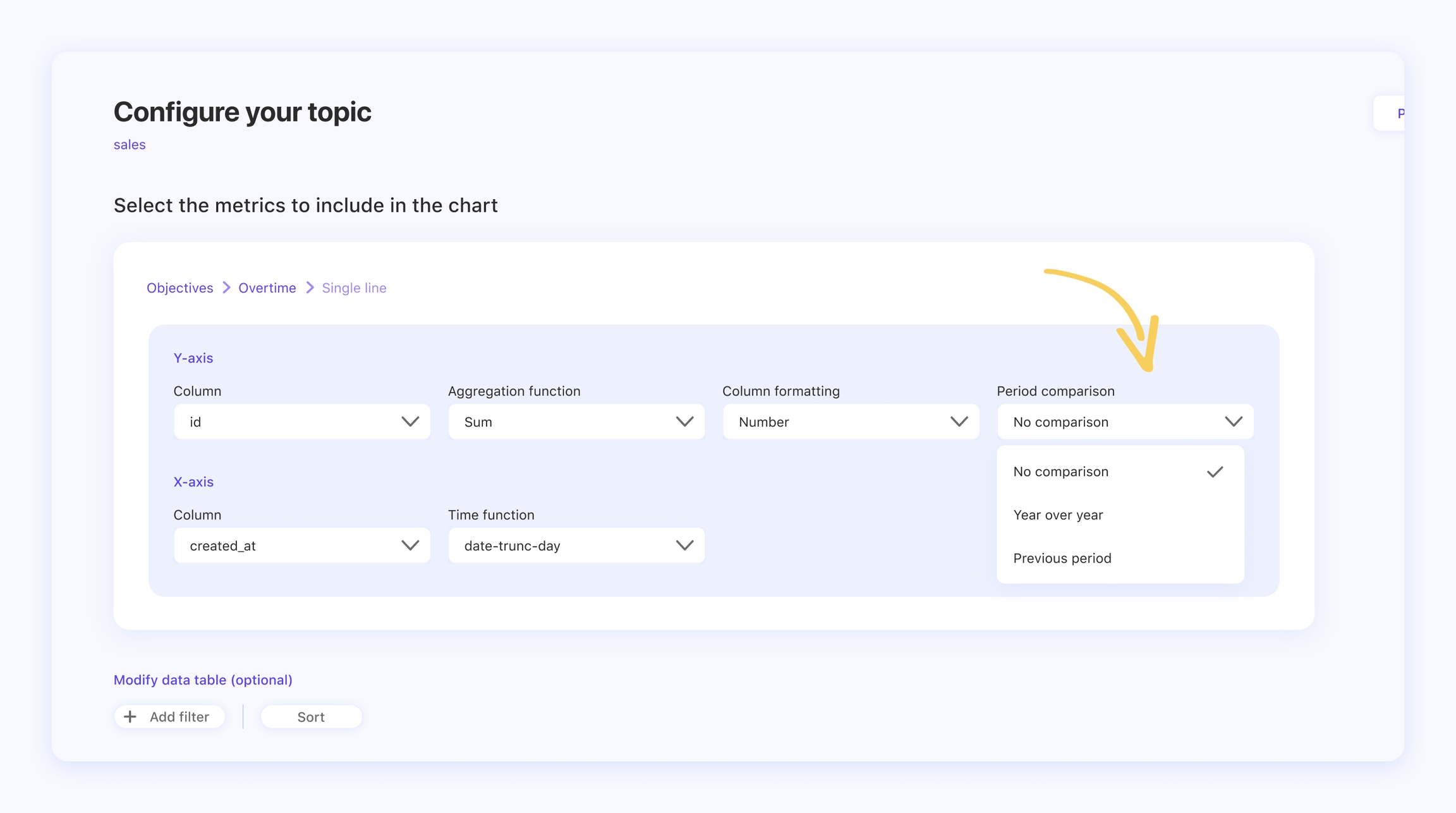
The single line chart offers the opportunity to make a period comparison with the same data from a previous period of time (e.g. Sales 2020 vs. Sales 2021).
The X-axis is a time series column, which aims to define the evolution of the measured value over a given time period. In the example of the topic Sales over time, the sales are grouped by time. You can choose a range of time, for example by day, month or year.
The single line chart visualization is ideal if you want to check out seasonal or yearly trends or, in general, trace a progression in a given amount of time.
We hope that this article helped you! Do you want to know how to build a list table? Check this out!


