# Objectives and Visualizations
After having selected the data tables that are needed to build your topic in the [**connect**](https://docs.igenius.ai/crystal-console/topics-configuration/connect) step you move forward to the [**topic configuration**](https://docs.igenius.ai/crystal-console/topics-configuration/configure).
This is the phase where you decide the information you want to get out of your data. The first decision to make is, **what will be the objective of the topic**?
## **What is an objective?**
An objective is essentially **the main purpose of the topic**. It sets the stage and drives the configuration process. Examples of objectives are comparison, ranking and progress overview of your data.
{% hint style="info" %}
When selecting an objective, keep **the end goal** of how all of your users will use this data in mind.
{% endhint %}
For example, if you want to compare two entities to identify similarities, differences and their overall performance, you can use an objective called **comparison**.
If instead you want to see the trend of a particular entity and its fluctuations in time, select the **over time** objective. After selecting an objective, you will then be able to view all the visualization types that satisfy that objective.
The first thing to do in the **configure** step is to select an objective.

## **The right objective for your goal**
You will choose the objective that is most accurately going to respond to your needs. In order to do this, you will have to define[ **the results you want to get out of the advisor**](https://docs.igenius.ai/crystal-advisor/access-to-crystal/how-to-interact-with-crystal)**.**
Here you can find a list of all the objectives available.
* **Over time**
It shows the evolution of data in a given amount of time, e.g. *Can you show me sales over the last month?*
* **Comparison**
It’s used to show, estimate, measure, or note the similarity or dissimilarity between different items or facts, e.g. *Can you show me a comparison of Sold vs. Budget?*
* **Composition**
It shows the breakdown of a total in its parts, e.g. *Give me a breakdown of total sales of shoes by item number.* Remember that this type of visualization works efficiently with positive values only.
* **Progress**
The status of an item or fact in relation to an objective or scale, e.g. *How long does it take to reach my 2020 sales target?*
* **Ranking**
It shows the position of different ordered items, e.g. *Who have been the top sellers in the last month?*
* **List**
A list of items that doesn’t follow any particular order, e.g. *Show me a list of vendor locations.*
* **Description**
A card or a form with the details of an item or an entity, e.g. *Give me the product details of the X3 sneakers item.*
* **Highlight**
The single, highlighted values that indicate the state or level of an item or fact, e.g. *Give me the total amount of the X3 sneaker sold.*
## **Visualization of the objectives**
Each objective can be represented with one or more **specific visualizations** that will help users to better interpret the data’s insights.
Visual representations are very useful to summarize results and can be easily shared with clients, colleagues and stakeholders.
In the following table, see the types of visualizations available for each objective we can associate with them (more are coming!).
| **Visualization** | **Applicable Objectives** |
| -------------------------------------------------------------------------------------------------------------------------------------------------------------------------------------------------------------------------------------------------------------------------------------------------------------------------------------- | ------------------------- |
| Single line\*

\*Compatible with Alerts
| Over time |
| Multi line
w/ Single entity:
.png)
w/ Multiple entities:
.png)
| Over time |
| Single column

| Comparison |
| Single column pos/neg

| Comparison |
| Cluster column
w/ Single entity:
.png)
w/ Multiple entities:
.png)
| Comparison |
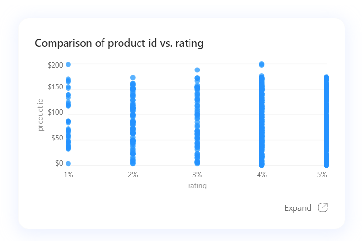
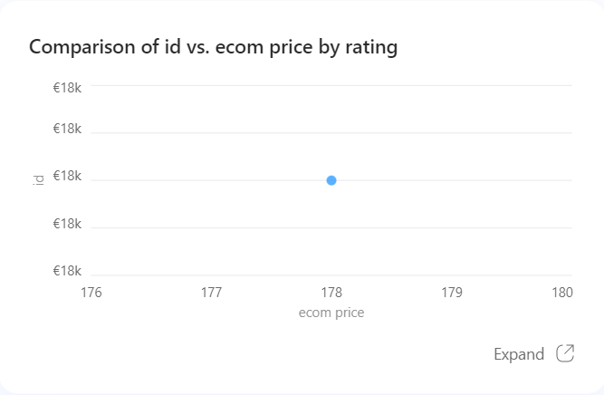
| Scatterplot
Two dimensional scatter: Three dimensional scatter:
| Comparison |
| Donut
.png)
| Composition |
| Progress gauge

| Progress |
| Donut gauge

| Progress |
| Table
List example:

Ranking example:

| List
Ranking
|
| Light Table

| Description |
| Scaled-up number\*

\*Compatible with Alerts
| Highlight |
Once you click on an objective, you need to choose one of the visualizations that is included in that objective. Once you have done this, you can move on to selecting the [**data columns**](https://docs.igenius.ai/crystal-console/topics-configuration/configure/..#h_4321046c82) that will build your topic.

Was this article helpful? We really hope so! Go ahead with topic creation by finding out [**how to connect data sources**](https://docs.igenius.ai/crystal-console/topics-configuration/connect/manage-data-sources)**.**
***


.png)
.png)


.png)
.png)
 Three dimensional scatter:
.png)


