Configure Key Values
This page is currently under review. Stay tuned!
The topic configuration process can be very articulated, depending on the insights you want to get out of your topic.
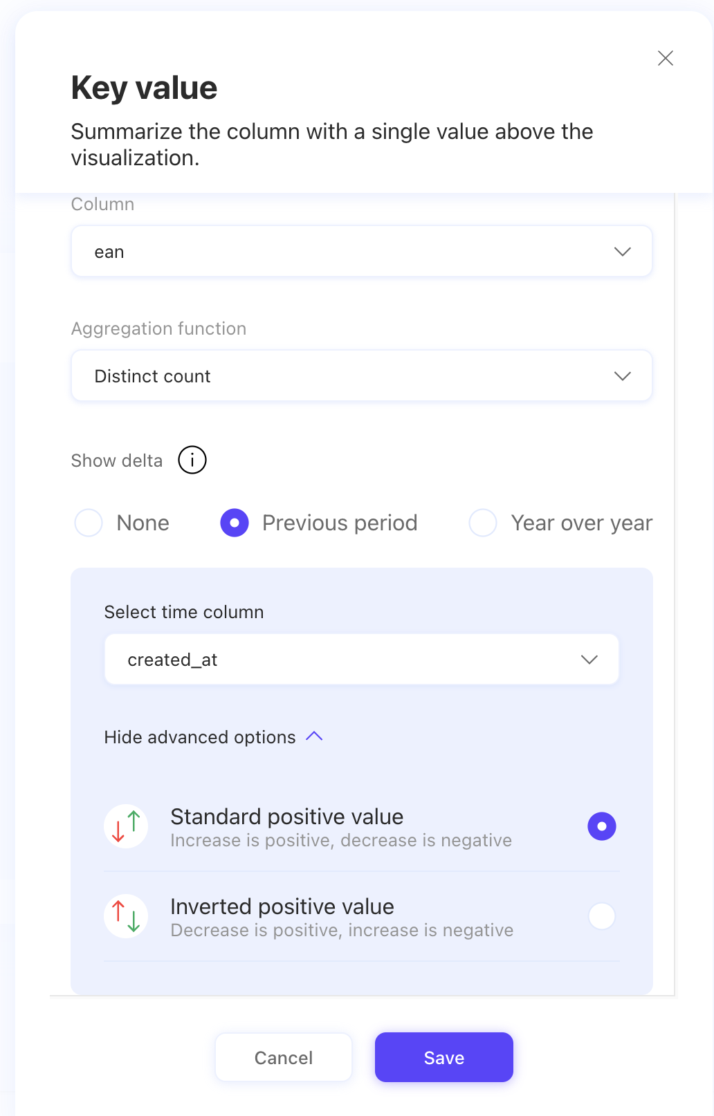
If you want to add a specific insight to your chart, you can click on Add key value and set the parameters to highlight a summary value of the measure column included in your topic. Each column with numerical data type will provide the option to add a key value, and you will be allowed to choose the column you want to add the key value to.

For example, if you are measuring sales, you could feature the average sales over the period of time selected as a key value to give an immediate idea of the measure.

You also have the option to apply a delta to the numeric value if there is a time series column present in the topic’s data tables. The delta can be shown as a value or percentage, representing the data change compared to the previous period or the same period of the previous year (year over year).
You need to specify if the delta is expressed in a percentage or an integer and you can also specify if the associated positive and negative growth is based on your data. An increase in costs for your situation might represent a negative impact, therefore it would make sense to have it represented in red. In another scenario, an increase in value could represent a positive event and therefore it would make sense to have it in green.

Once you save your key value, you will find it represented in the configuration view. You can always remove it or click on it to make changes. You can add as many key values as you need, just remember you can have only one per column per function, with the option to choose the column you want to add the key value to.

Do you want to know how to modify a data table? Check out this article!
Last updated
Was this helpful?